
The Problem
How do you illustrate something as abstract as a value?
Every company has values that guide its mission (or at least every company should). Fort Point Beer Company is no different. After years of internal dialogues and soul-searching, the leadership team at Fort Point came up with five values that put into words things that were always there.
But how do you take these values beyond words? Is there a way to capture their essence that is fun and illustrative? These were the questions we asked when we decided to create custom notebooks with the values printed in them.
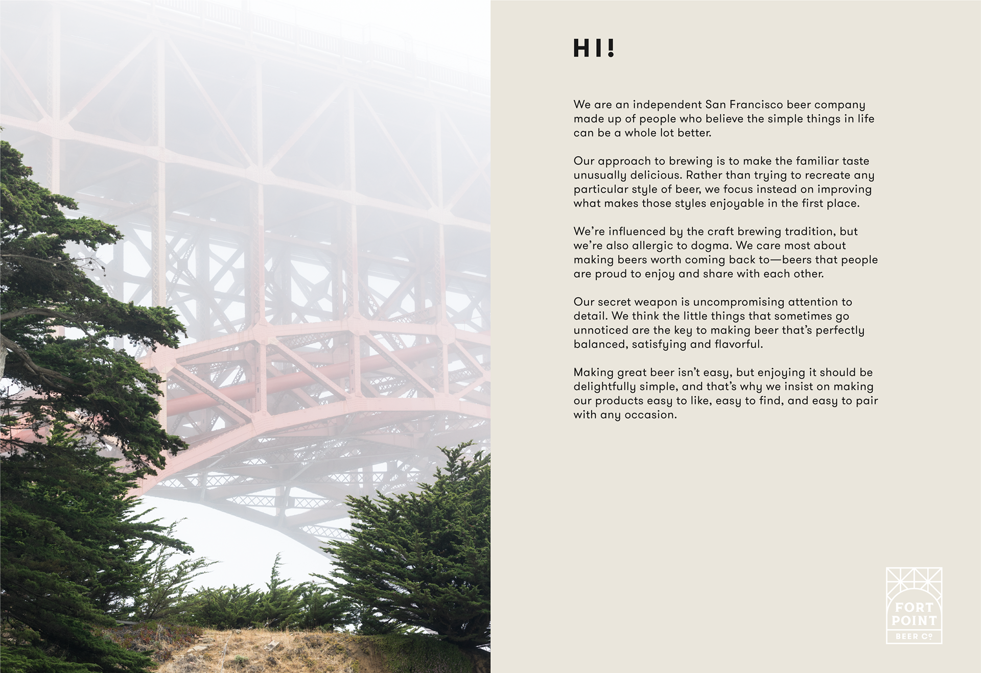
Fort Point Beer Company
Core Values
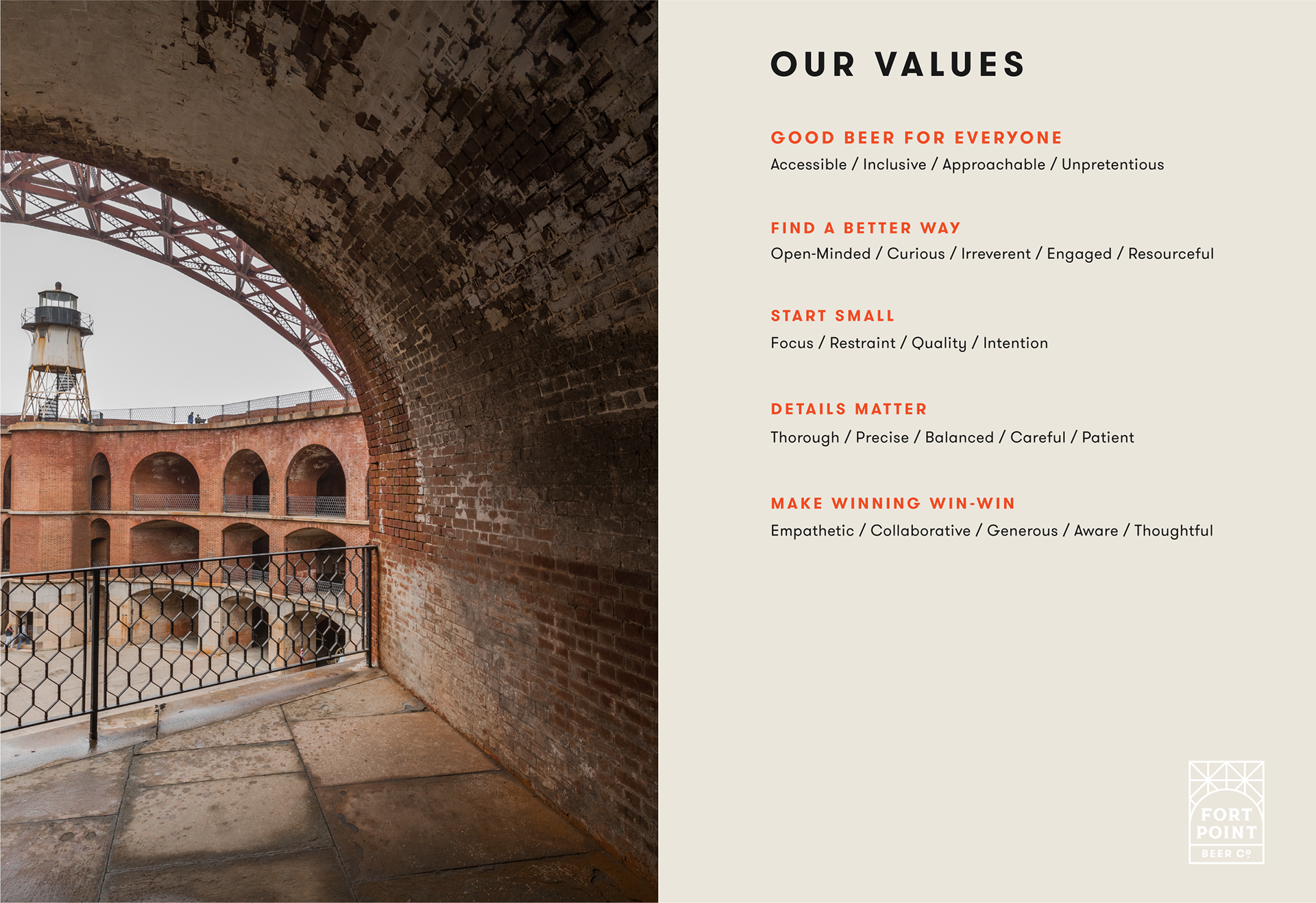
Good Beer for Everyone
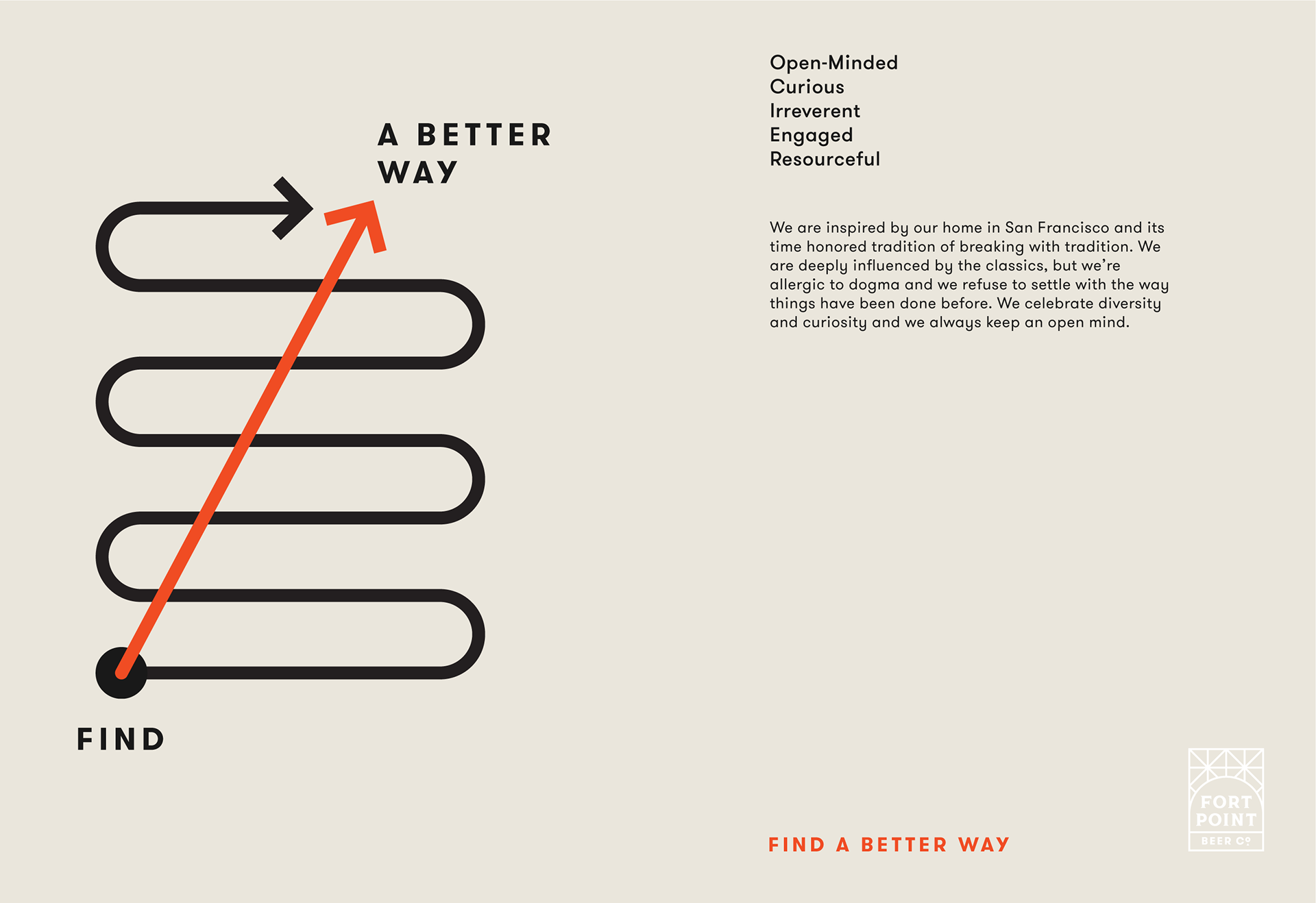
Find a Better Way
Start Small
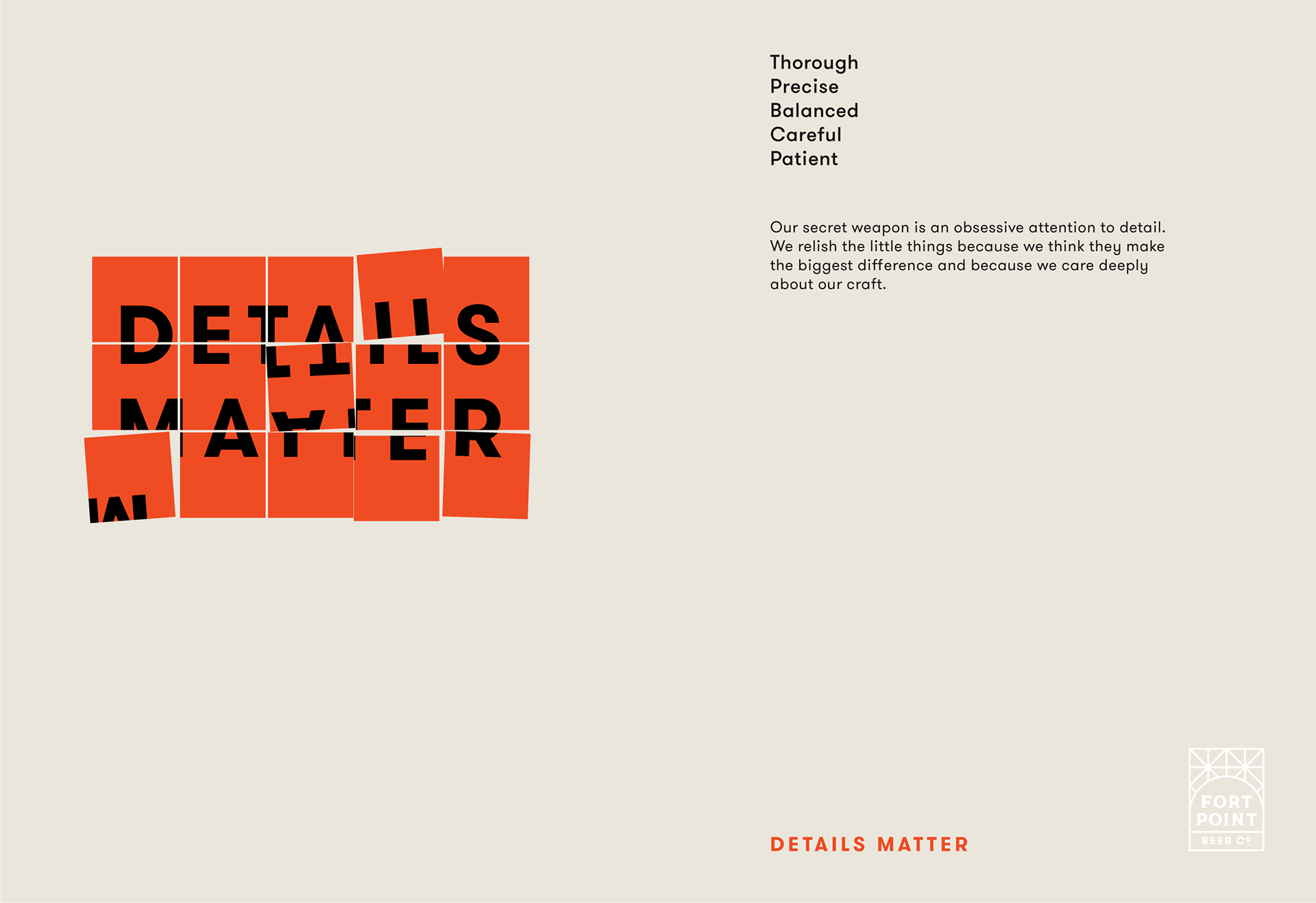
Details Matter
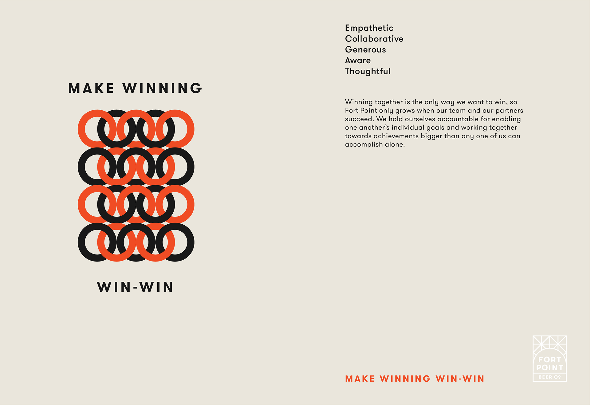
Make Winning Win-Win
(As you can tell, fairly abstract.)
Design Process
I began with just the words. I played around with different layouts and hierarchies to try and just let the words speak for themselves. The results, while maybe nice to look at, were flat and lacked the whimsy and playfulness present in the company culture.
This last point was very important to us. Company values can feel forced or contrived. However, we really felt that these values were derived from the company's existing culture and wanted to make sure the design felt just as natural.
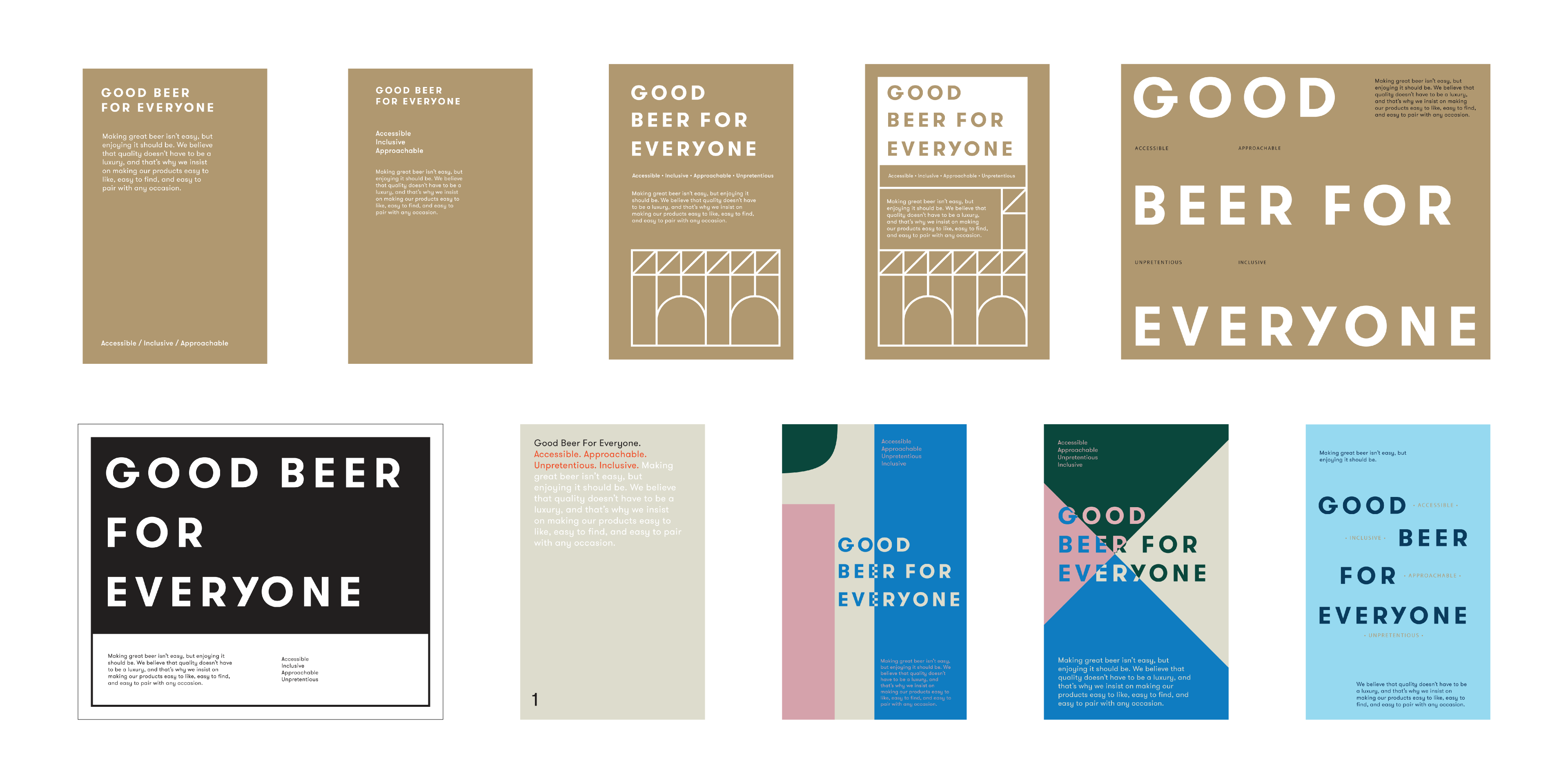
Initial concepts
It wasn't until I began to illustrate the concepts with lines and the type that the values began to come to life.
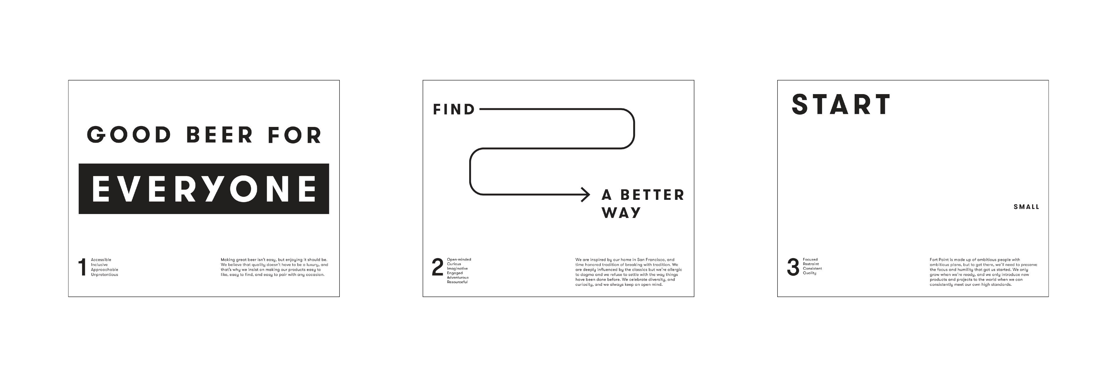
First stab at illustrating the values with line and type
For the next round, I wanted to unify each illustration with a common theme: the can. However, with so many different departments doing different things we realized that not all members of the Fort Point team deal with the cans themselves. So we scrapped this idea in favor of something more relatable.

Cans are too specific to one department
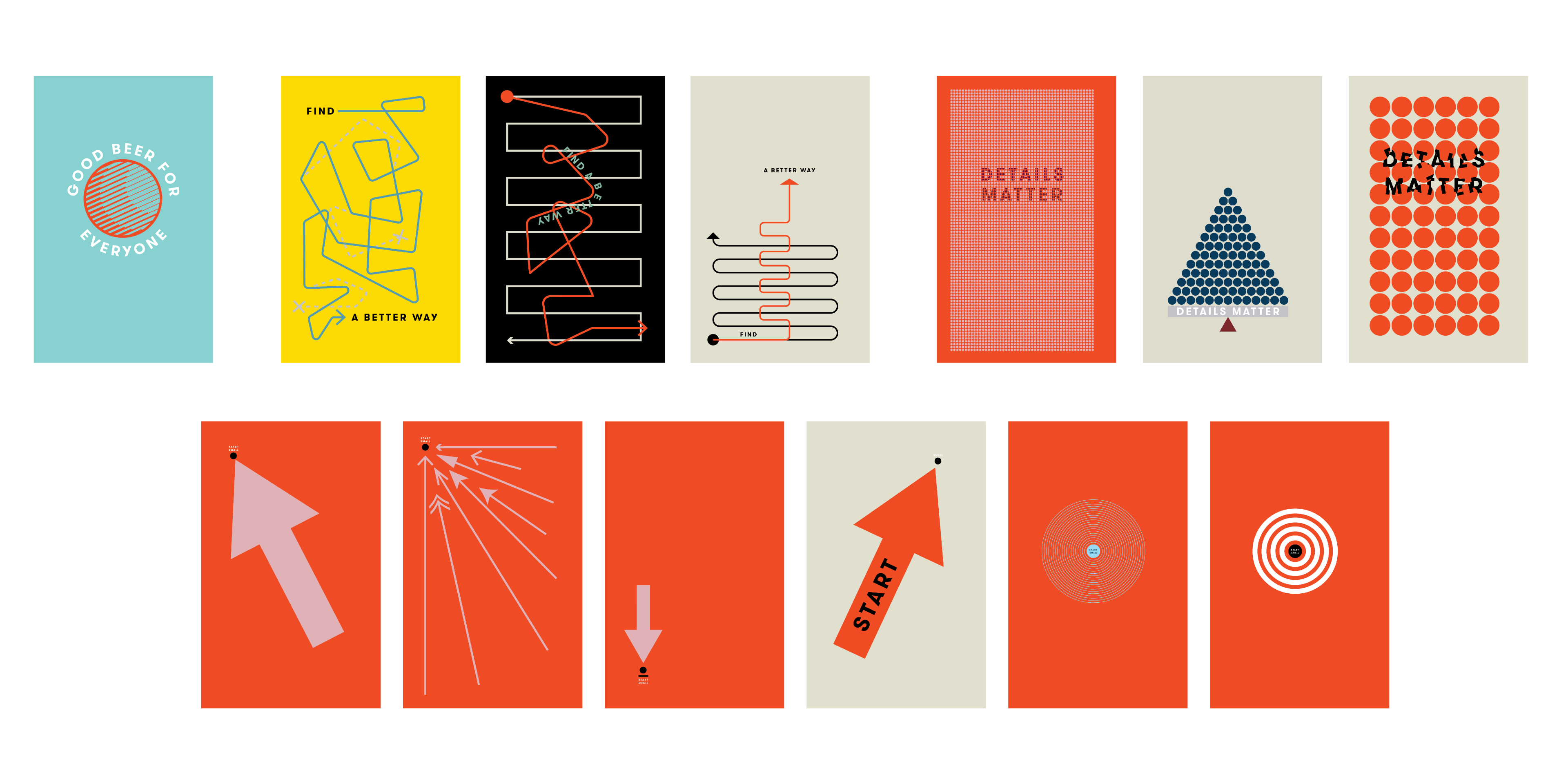
We went through several iterations of ideas. We thought more expansively about what the words meant, while carefully balancing abstraction against clear illustration of the value.
Good Beer for Everyone - The main icon being a globe representing everyone.
Find a Better Way - I wanted to show that there is a better way than just following along the traditional route and doing what everyone else does.
Details Matter - Everything in it's place and a place for everything.
Start Small - Trying to illustrate focus and restraint.
Two of the values (Good Beer for Everyone and Make Winning Win-Win) went through very meticulous design iterations.
For Details Matter, it was important to illustrate that Fort Point is part of a larger fabric and that we rely on our customers and partners as much as they rely on us. The many links required a lot of finessing to get just right.

Study of shape and arrangement of links
Good Beer for Everyone was a challenge. I wanted to see how far I could push the globe icon.
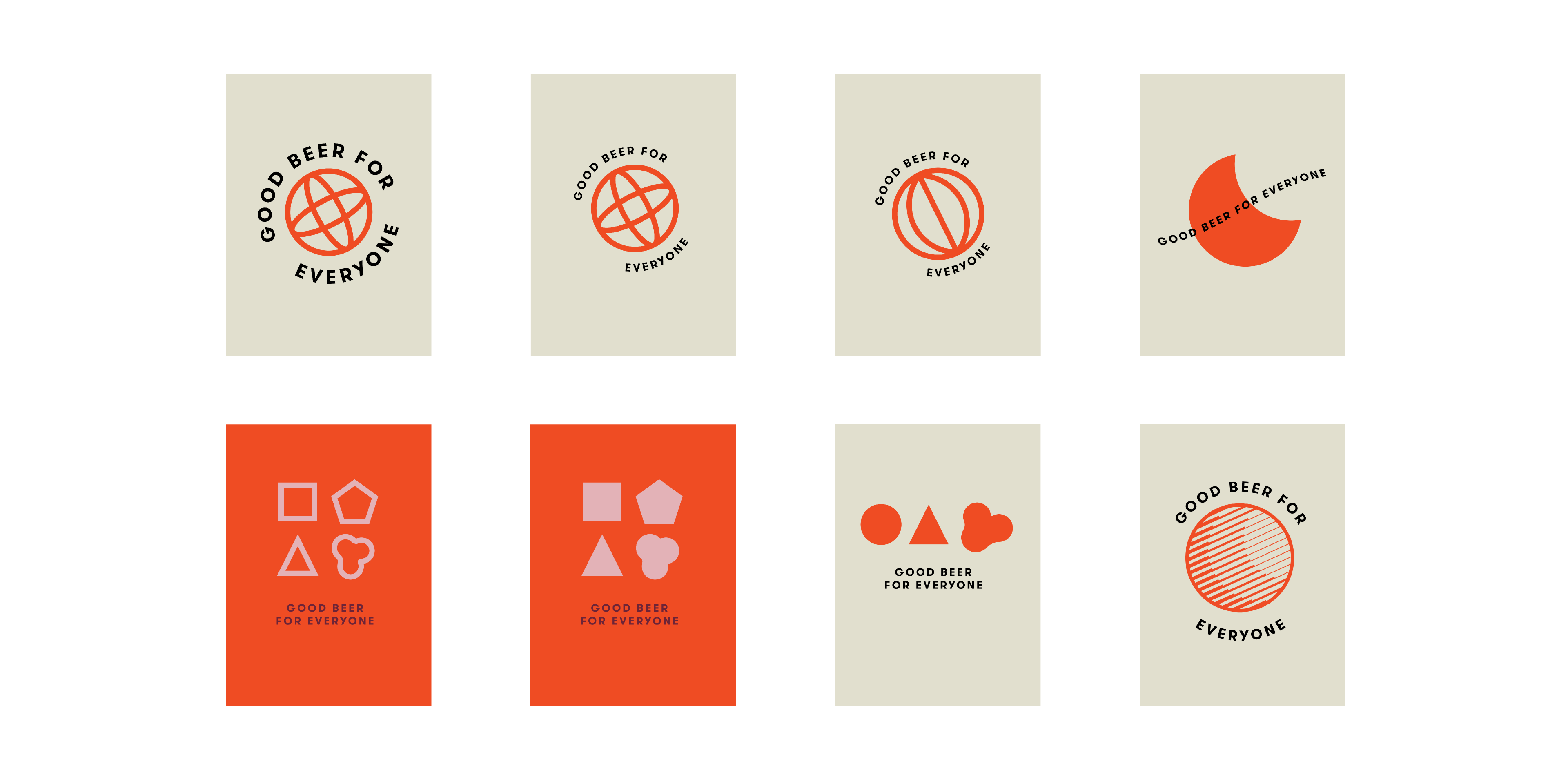
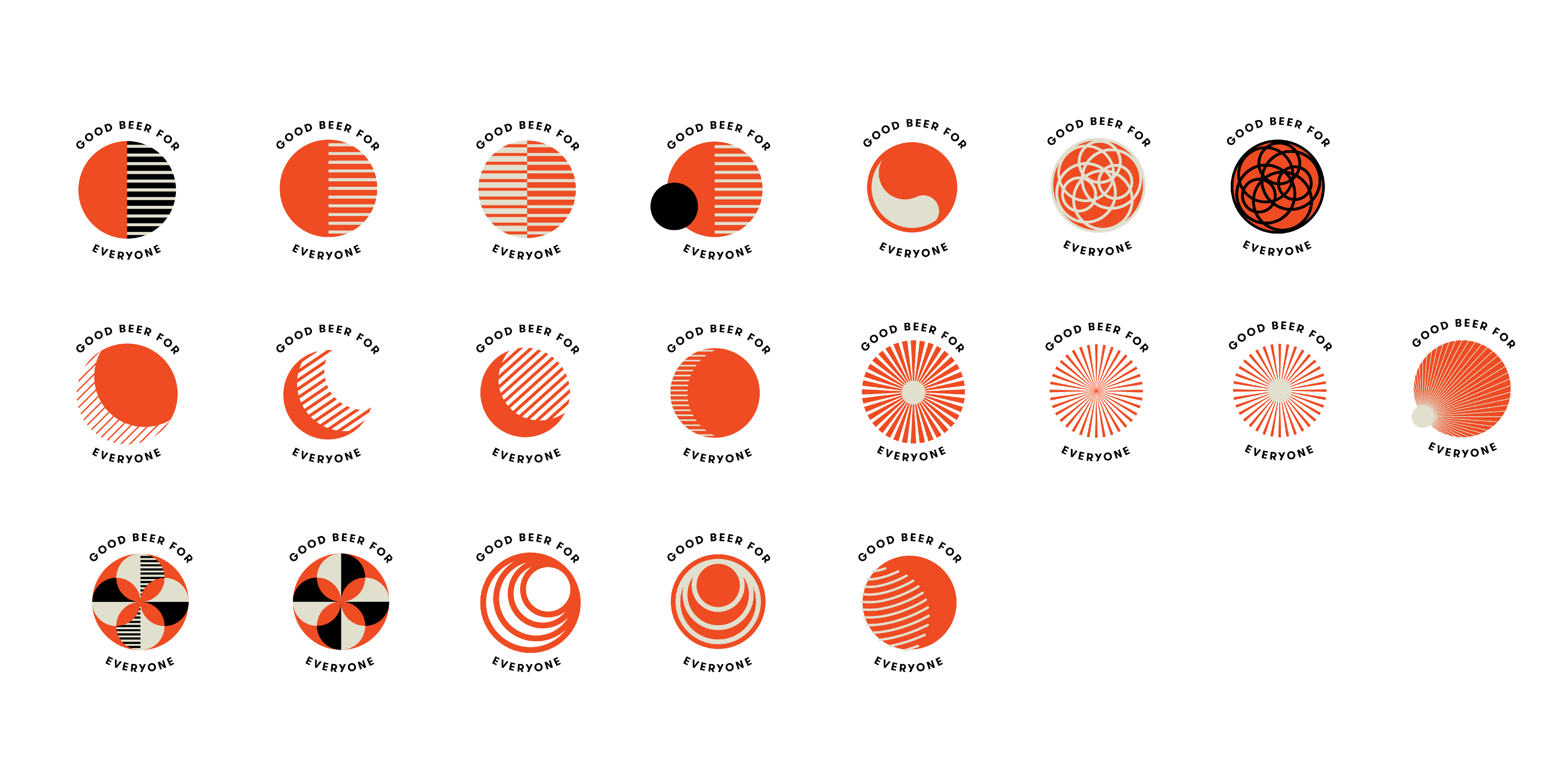
Icon studies
When we landed on the illustrations we wanted we went through many color studies. The color combinations here only utilize colors from the different Fort Point brands.

Final Design
The final version captures that fine balance we were looking for: illustrating the values clearly while making the illustrations abstract enough that anyone at Fort Point can feel like it applies to them.


As a final touch, we debossed a cryptic set of symbols on the cover of the notebook, drawing from the illustrations of each value. Mysterious and abstruse, the only way to discover the meaning is to understand each value.
